|
|||||||
| Notices |
 |
| Thread Tools |
 09-12-2008, 06:33 PM
|
#1 |
|
Loremaster

Join Date: Apr 2005
Location: Florida
Posts: 122
|
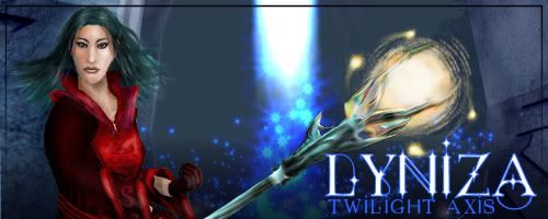
This is my first attempt... so be nice! But please feel free to offer constructive criticism! Background is actually an unedited shot from EF in the valley with all the sheep/minotaurs.
__________________

|

|

|
|
09-12-2008, 07:23 PM
|
#2 |
|
Loremaster

Join Date: May 2005
Posts: 2,399
|
Not bad for a first attempt, hun. It seems a little dark, even by my standards. /coughs Some suggestions to help ya out.
Good luck, and have fun playing around with it!
__________________
 Decorating is 1% inspiration, 9% work, and 90% tweaking. I've spent many an hour just moving things I've placed an inch or so over "that-a-way." |
|
|
|
|
09-12-2008, 10:11 PM
|
#3 |
|
Tester
Join Date: Nov 2004
Location: Marlborough, MA
Posts: 1,641
|
I agree with everything so far. * Don't try to compose your sig in-game. * High-quality, close-up, well-lit screenshots of your character are the easiest to work with. If you start with a really great character shot, you can do anything you want to with it -- darken it, brighten it, saturate it, grunge it up...anything! -- and your end result will probably also be great. * Remember that it's much better to shrink a large image than to try to enlarge a small one. Enlarging screenshots results in a significant loss in quality and fine details, and you can't really fix that without using some of the more advanced repainting techniques. * Explore the world of fonts! You've got a decent start here, but definitely don't be afraid to play around. Layers are your best friend, and practice makes perfect.
__________________
Cloak Designer · Sigs · UI Mods · Roster Master · EQ2 Gallery · Follow Me! · G33kG0dd3ss |
|
|
|
|
09-12-2008, 10:47 PM
|
#4 |
|
Loremaster
Join Date: Dec 2005
Posts: 134
|
?Yep yep! I agree with everything above and think its a good place to start! find your select tool and utilize it ( with cut) Layers layers layers! Save save save! Youll want to save alot.. I usually save each time I do some significant change in the signature, and just stick a number after that saved sig.. youll want to save in a format that allows layers. ( psp, PSD and not sure what [Removed for Content]'s format is) Ill see if I can find some old WIPs I have laying around if they might be any help. Heres one Ive done.. mind you this is years old.. but its good enough to show how I would work on things.. first http://img.photobucket.com/albums/v...sien/SSpsp9.jpg crop out the figure and any bits you dont want in the final image http://smg.photobucket.com/albums/v...iza4example.jpg this ss was one I took to show before and after work on the character.. hair and dodge/burn and smudge etc http://img.photobucket.com/albums/v...en/lyniza10.jpg added background and cropped
added text and finishing touches
__________________
 My Gallery = http://vanesse.deviantart.com/ My Gallery = http://vanesse.deviantart.com/ |
|
|
|
|
09-13-2008, 11:49 AM
|
#5 |
|
Loremaster
Join Date: Apr 2005
Location: Florida
Posts: 122
|
Awesome thanks so much for the feedback. I'm gonna be working some on it and see what changes I can make Did want to say tho- the picture is actually a screenshot of my toon cut out of another one and pasted onto that one, I tried smudge/blur on the edges to make it a smoother transition but even I can see there's a bit more to be done. And thanks for the font info! I'll have to take a look and see if i can find a quirky one to fit me! Thanks ever so much guys for all the help!
__________________
|
|
|
|
|
09-13-2008, 02:59 PM
|
#6 |
|
Loremaster
Join Date: Apr 2005
Location: Florida
Posts: 122
|
Ok I redid this one (had to use same small pic of the toon, having some issues with my screenshots atm =-/ can't seem to get some to open to save my life) But I blurred a bit of the harsh lines, smudged a bit more, and brightened the background. Also I downloaded a few new fonts and redid the text on it.
__________________
|
|
|
|
|
09-13-2008, 03:29 PM
|
#7 |
|
Loremaster
Join Date: Dec 2005
Posts: 134
|
if you do a little bit of drop shadow, in a darker color ( doesnt even have to befull opacity) itll add a bit of contrast between the text and the background, but not so much that itll make it stand out too bold.y ( just to make it a lil easier to read You could also add a little bit of stroke and itll do the same for you
__________________
My Gallery = http://vanesse.deviantart.com/ |
|
|
|
|
09-19-2008, 04:45 AM
|
#8 |
|
Loremaster

Join Date: Aug 2005
Posts: 181
|
Something I've found out about smudging edges is to use a small brush, like 3 px, and a very low strength, like 10 or 11%. It'll smooth out those yucky pixely edges without making the picture look blurry
 Your first sig looks WAAAAY better than my first one did! Keep up the good work! Your first sig looks WAAAAY better than my first one did! Keep up the good work!
__________________

|
|
|
|


 You can combine a good screenshot of your character with a good screenshot of your background scenery of choice using a decent graphics program a LOT more easily than you can take a sig-quality "all-in-one" shot in-game.
 There are lots of free/free for personal use fonts out there, so it's easy to find one that suits your character's personality and the mood of your sig. One of my favorite sites is