
|
|||||||
| Notices |
 |
| Thread Tools |
 07-24-2008, 02:40 AM
|
#1 |
|
Server: Mistmoore
Guild: The Collective
Rank: Inactive
Loremaster

Join Date: Oct 2005
Posts: 44
|
|

|

|
|
07-24-2008, 02:50 AM
|
#2 |
|
Server: Mistmoore
Guild: The Collective
Rank: Inactive
Loremaster
Join Date: Oct 2005
Posts: 44
|
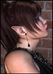
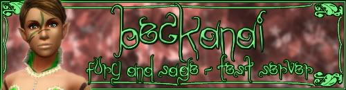
whew got it to post, dunno what i did tho guess my PC was lagging or something and wouldnt load it right, but w/e it seems to be working now ... but anyway, 1-10 10 being best what do you guys think? (Both made by me, the actual siggy was my 1st try, posted one is 2nd / 3rd attempt for a guildie |
|
|
|
|
07-24-2008, 03:41 AM
|
#3 |
|
Loremaster

Join Date: Nov 2004
Posts: 1,007
|
Just from a readability point of view , I find the text on the 2nd one difficult to read.
__________________

|
|
|
|
|
07-24-2008, 04:12 AM
|
#4 |
|
Tester

Join Date: Nov 2005
Location: Oklahoma
Posts: 460
|
Great start! Particularly on the blue one, the background is nice, and your overall color pallette is soothing and harmonious. I can tell you've got a good eye for how colors go together.Now for the constructive part. The text on both sigs is hard to read, particularly the red one. I'd darken the colors of the text quite a bit to increase the contrast with the background. Also, you've chosen three different fonts on the blue sig, I'd stick with two max, and pick two that complement each other; you've got plain, scripty, and funky all together. It seems that your characters are getting squished somehow when you're putting them into the image. Make sure when you're resizing that you're constraining your proportions. Also, you might try increasing both the brightness and the contrast on her to make her "pop" more from the background.All-in-all, I can see a lot of improvement between your first and second attempts, keep it up!
__________________

|
|
|
|
|
07-24-2008, 10:47 AM
|
#5 |
|
Tester
Join Date: Nov 2004
Location: Marlborough, MA
Posts: 1,641
|
I think Kethaera has already pointed out just about everything, hehe. Your characters are squished, which can make your work look very amateurish. We want to see your character in all their well-proportioned glory! Your fonts and images are very pixelated...it looks almost as if the sigs were created small and then made larger (which might also explain the character proportions). It's always best to start with a canvas [blank image] that is the size you're aiming for, or with a canvas that is larger (but proportionally so!) and then shrunk. I personally find it easiest to work in "actual size," since it gives me a real-time view of how small fonts and other fine details will look on the finished product. Great use of color, but bear in mind that colors can sometimes go too well together, hehe. Instead of changing the color of the text, you can also try adding a drop shadow or glow effect, which will help your text be more easily distinguished from the background. Also be aware that some fonts are impossible to read at small sizes. I like to use a fancy font for the larger text (character and guild name, usually) and a much simpler, coordinating font for the small text (classes, server, quote, etc.). All that being said, you've made a great start.
__________________
Cloak Designer · Sigs · UI Mods · Roster Master · EQ2 Gallery · Follow Me! · G33kG0dd3ss |
|
|
|
|
07-24-2008, 02:56 PM
|
#6 |
|
Tester
Join Date: Oct 2007
Posts: 677
|
I'm not one for making signatures, I am still working on getting things down myself, but I think as the first few you are doing quite well. You have to learn somewhere and I think it's a wonderful start!

__________________
 |
|
|
|
|
08-08-2008, 01:44 AM
|
#7 |
|
Server: Mistmoore
Guild: The Collective
Rank: Inactive
Loremaster
Join Date: Oct 2005
Posts: 44
|
been working on new ones for my exdirge-now-troub lol only a few little things are different between the two i did, didnt play with the actual look of the character this time, i tried to focus more on making it pop out and not seem "squished" (tho i really had no idea what i was looking for =/ )
|
|
|
|
|
08-08-2008, 01:47 PM
|
#8 |
|
Loremaster
Join Date: Dec 2005
Posts: 134
|
doing great hun! Keep playing with it and dont be afraid to experiment.. I learned alot just messing around and trying to see "Whats this button do?" and save alot! and layer alot!

__________________
 My Gallery = http://vanesse.deviantart.com/ My Gallery = http://vanesse.deviantart.com/ |
|
|
|


