
|
|||||||
| Notices |
 |
| Thread Tools |
 09-26-2007, 07:57 PM
|
#1 |
|
Server: Oasis
Guild: Mojo Rising
Rank: Full Member
Loremaster

Join Date: Dec 2004
Posts: 13
|
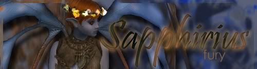
      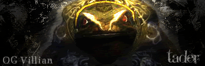    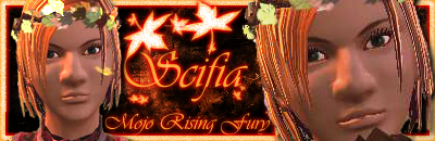 I have been messing with photoshop for several months and enjoy making people signatures and guild banners. I have been messing with photoshop for several months and enjoy making people signatures and guild banners.
|

|

|
|
09-26-2007, 08:12 PM
|
#2 |
|
Server: Antonia Bayle
Guild: Aiaru
Rank: Gypsy Royalty
Guardian

Join Date: Aug 2007
Posts: 350
|
VERY nice!!
|
|
|
|
|
09-26-2007, 08:37 PM
|
#3 |
|
Loremaster

Join Date: May 2005
Posts: 2,399
|
Ooooo. I likey!
__________________
 Decorating is 1% inspiration, 9% work, and 90% tweaking. I've spent many an hour just moving things I've placed an inch or so over "that-a-way." |
|
|
|
|
09-26-2007, 10:43 PM
|
#4 |
|
Server: Oasis
Guild: Fabled
Rank: Junior Member
Elder

Join Date: Sep 2007
Posts: 119
|
Those are great!!
__________________

|
|
|
|
|
09-29-2007, 12:47 AM
|
#5 |
|
Loremaster

Join Date: Nov 2004
Posts: 130
|
Looking good Traven! I always thought your work was great!.... and on another note -- miss ya! /hugs
__________________

|
|
|
|
|
09-29-2007, 10:32 AM
|
#6 |
|
Server: Oasis
Guild: Mojo Rising
Rank: Full Member
Loremaster
Join Date: Dec 2004
Posts: 13
|
thanks for the support Sera. I miss everyone too!!
|
|
|
|
|
09-29-2007, 12:55 PM
|
#7 |
|
Loremaster

Join Date: Nov 2004
Location: Dallas, TX
Posts: 965
|
Awesome sigs
 I love your use of colors.I especially love the last rat one. I love your use of colors.I especially love the last rat one.
|
|
|
|
|
10-05-2007, 04:53 PM
|
#8 |
|
Server: Oasis
Guild: Mojo Rising
Rank: Full Member
Loremaster
Join Date: Dec 2004
Posts: 13
|
i wanted to test this out and see what everyone's opinion was on it.

|
|
|
|
|
10-05-2007, 05:06 PM
|
#9 |
|
Loremaster
Join Date: May 2005
Posts: 2,399
|
Ummm. Is it supposed to move?
__________________
Decorating is 1% inspiration, 9% work, and 90% tweaking. I've spent many an hour just moving things I've placed an inch or so over "that-a-way." |
|
|
|
|
10-05-2007, 05:08 PM
|
#10 |
|
Server: Oasis
Guild: Mojo Rising
Rank: Full Member
Loremaster
Join Date: Dec 2004
Posts: 13
|
no..just different from the traditional horizontal look.
|
|
|
|
|
10-05-2007, 05:22 PM
|
#11 |
|
Loremaster

Join Date: Nov 2004
Location: kk thx la~
Posts: 1,341
|
Traven@Oasis wrote:
i wanted to test this out and see what everyone's opinion was on it.I like it cause it's different.
__________________
Blaye | 80 Guardian | Leader of Anomaly 
|
|
|
|
|
10-05-2007, 05:29 PM
|
#12 |
|
Loremaster
Join Date: May 2005
Posts: 2,399
|
Traven@Oasis wrote:
no..just different from the traditional horizontal look.Looks cool. I wasn't sure if it was animated or not. I kept waiting to see if it would do anything. Hehehe.
__________________
Decorating is 1% inspiration, 9% work, and 90% tweaking. I've spent many an hour just moving things I've placed an inch or so over "that-a-way." |
|
|
|
|
10-05-2007, 05:38 PM
|
#13 |
|
Server: Oasis
Guild: Mojo Rising
Rank: Full Member
Loremaster
Join Date: Dec 2004
Posts: 13
|
here it is at 410 x 150

|
|
|
|
|
10-05-2007, 05:51 PM
|
#14 |
|
Server: Antonia Bayle
Guild: Aiaru
Rank: Gypsy Royalty
Guardian
Join Date: Aug 2007
Posts: 350
|
My vote's going to go in as "Traditional" on this one.
|
|
|
|
|
10-05-2007, 06:14 PM
|
#15 |
|
Server: Oasis
Guild: Mojo Rising
Rank: Full Member
Loremaster
Join Date: Dec 2004
Posts: 13
|
now im just messing around with it

|
|
|
|
|
10-05-2007, 06:16 PM
|
#16 |
|
Server: Oasis
Guild: Mojo Rising
Rank: Full Member
Loremaster
Join Date: Dec 2004
Posts: 13
|
K_Aramae wrote:
My vote's going to go in as "Traditional" on this one.Thanks for your input! |
|
|
|
|
10-05-2007, 09:03 PM
|
#17 |
|
Loremaster
Join Date: Nov 2004
Posts: 130
|
Very fun Traven! That is definitely thinking out side the sig box...
__________________
|
|
|
|
|
10-05-2007, 09:40 PM
|
#18 |
|
Loremaster
Join Date: May 2005
Posts: 2,399
|
Ya know, with is slanted like that, the picture's gotten a lot smaller. Had ya thought about redoing the original image itself so that your character appears bigger on it? I kind of like the 3-d slant on it myself.
__________________
Decorating is 1% inspiration, 9% work, and 90% tweaking. I've spent many an hour just moving things I've placed an inch or so over "that-a-way." |
|
|
|
|
10-06-2007, 12:34 AM
|
#19 |
|
Server: Oasis
Guild: Mojo Rising
Rank: Full Member
Loremaster
Join Date: Dec 2004
Posts: 13
|
well thanks everyone that gave me your input...It will take some getting use to and is different from everyone else, but i like it, so i think im gonna stick with it until i get tired of looking at it!
|
|
|
|
|
10-06-2007, 03:45 PM
|
#20 |
|
Loremaster

Join Date: Nov 2004
Posts: 344
|
Traven@Oasis wrote:
well thanks everyone that gave me your input...It will take some getting use to and is different from everyone else, but i like it, so i think im gonna stick with it until i get tired of looking at it! I like your idea, however I think you need to change the font, on the side like that it's not very reading very well. I looked at all the versions and I'm not really sure what your name is, which is the idea behind a sig Just to put another slant on this style, what if you changed the composition of the signature itself, to play into that slant? That could push it even further.
__________________

|
|
|
|


